animations
Authors: @yosefanajjar & @fares98
Maintainer: @MohammedYehia
Welcome To The CSS Animations Workshop!#
This workshop is designed to introduce you to a modern topic in CSS which is CSS Animations, there will be a fine explanation of what is it and how to do it, so by the end of the workshop you are expected to understand CSS Transform, Transition, Animation properties and how to make your own keyframes in CSS.
What is CSS Animations?#
CSS Animations allows you to change an element style, like moving an element from left to right for a specific amount of times. They consist of two things CSS styles describing how the element will look like and keyframes that specifies the styles of the element in the start and the end of the animation.
Important Note: you can make simple animations without using keyframes by using the transform and transition properties.
Making an Animation#
Before we get into that, we need to make sure that you understand some important CSS properties that we have mentioned before like:
Transform
The transform CSS property used for changing the shape and position of the affected element and allows you to translate, rotate, scale, and skew elements.
Translate: A method for moving the element from its current position:
- translateX(px): moves the element relative to its X-axis
- translateY(px): moves the element relative to its Y-axis
- translate(px, px): the first value is for the x-axis and the second is for the y-axis
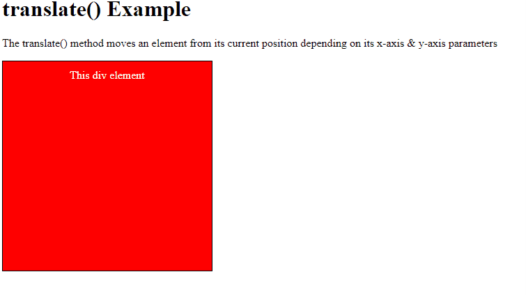
In the example above, the targeted element is moved 50px to the right and 20px to the top from its current position
Hint:
all the transform methods can accept positive or negative value.
Scale: A method for resizing an element, increasing it or decreasing it based on the given value:
- scaleX(value) increases or decreases the width of an element - scaleY(value) increases or decreases the height of an element - scale(value, value) increases or decreases the width and height of an element by providing values for both - scale(value) increases or decreases both width and height of an element by providing a single value
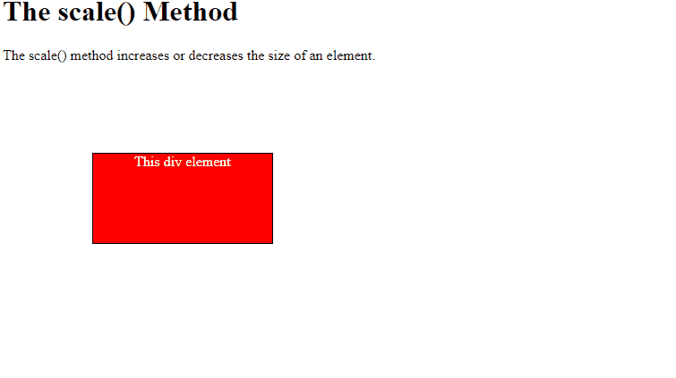
In the example above, the targeted element will be scaled 200% horizontally and vertically.
Rotate: A method for rotating an element clockwise or counter-clockwise according to a given degree:
- rotateX(value) rotates the element relative to its x-axis - rotateY(value) rotates the element relative to its y-axis - rotate(value) rotates the element relative to both x and y axis
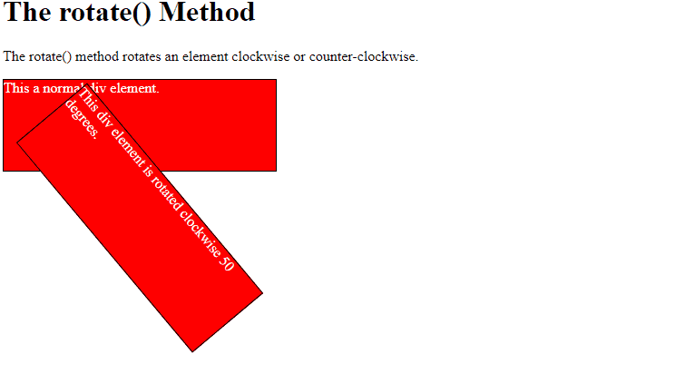
In the example above, is rotated 50 degress clockwise, when giving negative values it would be rotated counter-clockwise
Skew: A method that skews an element:
- skewX(deg) skews an element along the X-axis by the given angle
- skewY(deg) skews an element along the Y-axis by the given angle
- skew(deg, deg) skews an element along the X and Y-axis by the given angles to each on of them
- skew(deg) skews an element along the X-axis and the Y-axis value is set to zero
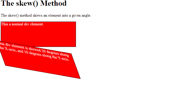
In the example above the element is skewed 20deg along the X-axis and 30deg along the Y-axis.
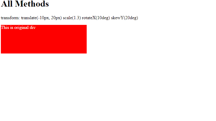
- all : all methods: - transform: translate(px, px) scale(num) rotate(deg) skew(deg, deg);
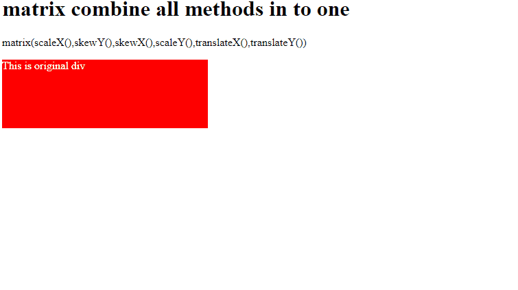
- matrix: a method combines all the 2D transform methods into one:
- matrix(scaleX(),skewY(),skewX(),scaleY(),translateX(),translateY())
Transition
Transition allow us to perform animations without using JavaScript! it allows you to change property values smoothly, over a given duration.
How to use transitions?
- Specify a property for the transition.
- Specify a duration time for the transition (ie. 2s)
The transition consists of:
- transition-property: a property using to specify the property (properties) that you want to apply the transition to it.
In this case, the transition would apply on the width property only.
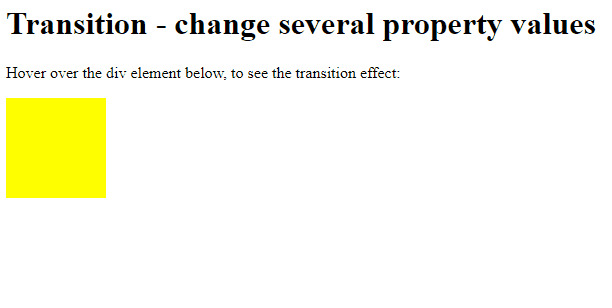
Several Property Values
- if you have more than one property you want to apply to it, you can add it in the same line:
- if you want to apply the transition on all properties you can use the method all:
if you added this code to the element style, the code could not run, but why? because we didn't add the second important property that is :
- transition-duration: a property using to specify the time that you want to apply the transition within it.
You may specify multiple durations, each duration will be applied to the corresponding property as specified by the transition-property.
if you think that this way confuses, you can use an easier way to implement the same code by the transition property:
and you can use the transition property with all methode:
in this case, all properties will take the same time.
For Example: Change Several Property Values:
In the example above we have a transition for the element that will happen when the width and height values change, but how will it change?
- transition-delay: a property specifies the time delay ( the time that should wait ) before starting the transition:
In this case, the transition will start after 3 seconds from load the page.
Hints:
This is property is optional, which means you can make an animation without using it.
you can use several values exactly as you used in the transition-duration property:
- transition-timing-function: a property specifies the speed curve of the transition effect.
Hints:
This is property is optional, which means you can make an animation without using it.
There are many values for this property, but we will discuss the five most used values in this workshop.
- linear: the same speed from start to end.
- ease: slow start, then fast, then end slowly.
- ease-in: slow start.
- ease-out: a slow end.
- ease-in-out: slow start and end.
- transition: a property is a shortcut for all the transition properties, in another meaning is property includes all the transition properties.
in this example, the transition would apply on all properties for the element within 4 seconds after delay 2 second by the linear method.
Animation
Now after we have known how we can use the Transforms and Transitions, We are ready to use CSS Animation.
Before we start we need to know it is:
@keyframes: a rule that specifies the animation code (the animation code will be inside it), it contains a style list, each style with a specified percentage.To start creating a keyframe you need to add keyframe_name, this name will be used to control the animation.
you can create keyframe without keyframe percentage, you can use:
This code mean:
Now we can create good animation
We have a lot of properties in the animation:
- animation-duration
- animation-delay
- animation-timing-function
we use these properties as we used the transition property
you may have many keyframes, did you ask yourself how this code will run the wanted animation?
honestly, this code wouldn't run any animation, to specify the wanted animation, you need to use:
- animation-name: this is will be the name that you added to the keyframe
- animation-iteration-count: a property specifies the number of times that you want to run.
in this case, the animation will run 5 times then will stop, if you don't need to stop the animation, you can use:
- animation-direction: a property specifies from where the animation will run (from start, from the end, in alternate cycles)
normal: The animation will run as normal (from 0% 100%). This is the default.
reverse: The animation will run in the reverse direction (fro 100% to 0%)
- animation-fill-mode:
none: the animation will not edit any styles before the animation run (Default value).
forwards: the element will stop with the style set by the last keyframe.
backwards: the element will start with the style set by the first keyframe, not the default style.
both: the element will start with the style set by the first keyframe, and will stop with the style set by the last keyframe.
- animation: a property is a shortcut for all the animation properties, in another meaning is property includes all the animation properties.
in this example, the keyframe_name animation would run from end to start after 2 seconds delay, duration 5 seconds, by the linear method, and this animation wouldn't stop.